Have you ever wondered what consumers truly think about your law firm’s website? If you want to maximize conversion rates, often the best way to do that is to conduct your own research or have someone do that testing for you. In order to help ensure that we are creating websites that convert well, we regularly conduct tests to help us determine the best ways to increase the performance of the sites we build. Some of that testing includes click-through tests, heatmap testing, focus groups and usability. Below is a sample of a recent usability test and as you can see it provides some great feedback.
What you learn from usability testing can be the difference between landing new clients or losing them.
One of the biggest mistakes I see law firms make is overlooking the importance of having a great design. Having a great website doesn’t just mean the design looks great but that’s it is performing the most important function which is converting website visitors. Your website can be the difference between landing a big case or losing it to a competitor. In the video above we see a perfect example of a firm who is losing potential clients. It is especially important to test like this if you are spending on SEO or paid search. Why spend money on Internet marketing if you aren’t maximizing the ability of your site to convert? That’s like throwing money out the window.
Running a Usability Test for Your Law Firm
In the example above we use a Concurrent Think Aloud (CTA) moderating technique in order to get the participants to speak their thoughts as they are browsing a website. This allows us to get “inside their head” of the participant as they keep a running steam of consciousness as they work. Other methods include:
- Retrospective Think Aloud (RTA) – The participant retraces their steps after the session is complete.
- Concurrent Probing (CP) – Requires participants to work on tasks and the researcher asks follow-up questions.
- Retrospective Probing (RP) – After the session is complete, the moderator asks questions about the participants thoughts and actions.
Important Tips
- Make the participant feel comfortable.
- Remind them you are testing the site, not them.
- Remain neutral.
- Do not ask leading questions.
- Record the sessions so you can review them later
How many participants should you have?

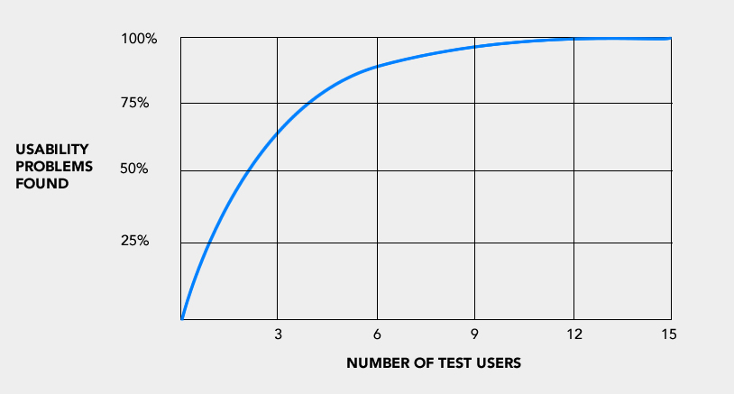
According to web usability consultant Jakob Nielsen just five participants are needed so it doesn’t need to involve a large amount of people. Five is usually enough for you to be able to uncover problems with your site. As with anything, this is the kind of thing where you get better conducting interviews with practice. Go out, find participants in your own market and start learning ways that you can help your site to generate more leads and cases for your law firm. If you feel like you don’t have the time, experience or you’d rather let the pros handle it for you, feel free to give us a call.

