These days it seems the the majority of personal injury lawyer websites are using chat popups to try and engage (or annoy) website visitors. If you are one of those law firms who uses chat popups on your site, be prepared to get hit with a penalty in January 2017.
In late August of this year, Google announced their intent to push rankings down for mobile sites that use interstitials as it provides a poor user experience. Specifically, Google said:
“To improve the mobile search experience, after January 10, 2017, pages where content is not easily accessible to a user on the transition from the mobile search results may not rank as highly.”
Read those last 5 words, “may not rank as highly.” That means Google will be pushing down the rankings of those sites that use interstitials.
What are Interstitials?
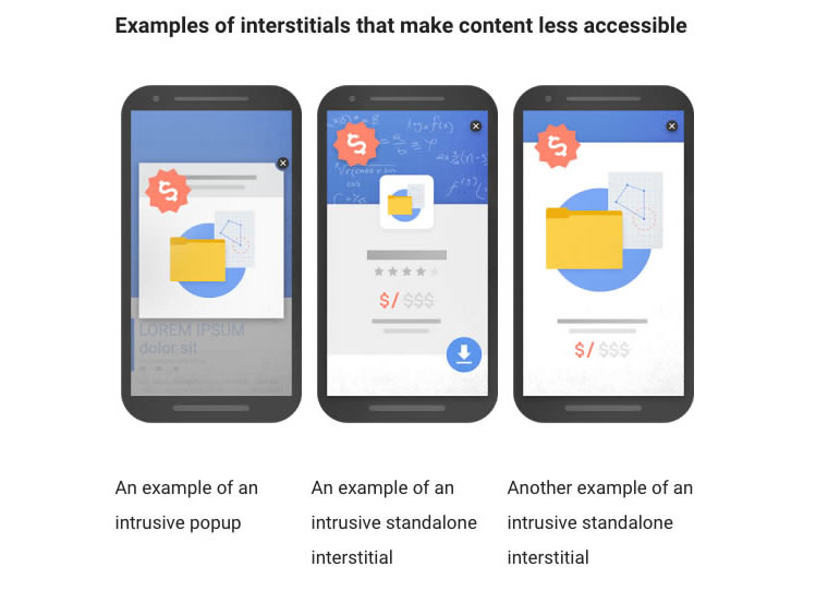
Website interstitials are ads or popups that cover all or a portion of the web page you are on. The point is often to display advertisements, warn of cookie usage on a site, push leads, collect emails, etc. The image below is the example given by Google on their blog post of the type of interstitial that they plan on penalizing for.

I, like most anybody else, am not a fan of popups. Google knows through research that popups are annoying to web users. They disrupt the user experience so Google is taking action and will be penalizing sites that use popups.
What Kind of Interstitials are OK?
According to Google, these are examples of the types of interstitials that are ok to use:
- A popup ad that is used as part of a legal obligation, such as warning a visitor that your site uses cookies
- Logins that are required prior to serving content that is not publicly indexable
- Banners that use a reasonable amount of screen space and are easy to close out
What does this mean if you use chat popups on your law firm website?
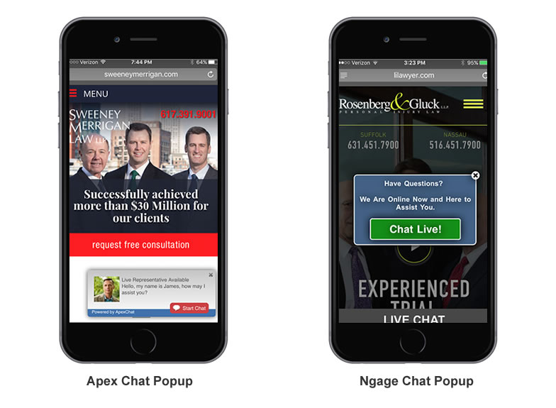
After speaking with our Google rep, we expect that law firms that use chat popups on their site to be hit with a mobile penalty. There are many chat vendors out there, but the two most common in the legal industry are Ngage and Apex. Below is an image of a chat popup on mobile for two of our clients who use Apex and Ngage.

The Apex chat popup is less obtrusive then the Nage chat but still disrupts the user experience. Both are incredibly annoying because the button to close out the chat is tiny (intentionally so by the chat vendors). Of course the chat vendors do not care about the user experience of your law firm’s website visitors so they don’t want to make it easy to close. We will have to see what kind of penalty will be dealt. You can be sure we will be monitoring how law firm sites are impacted. If you use Ngage, Apex or any other chat popup, are you willing to take the risk to find out?
Update: 12-7-2016
Ngage president Mark Shepherd contacted me and said they have updated their mobile chat pop-ups and he sent the example below. As you can see, the pop-up style has changed from the example I initially posted in October. The popup is triggered after a user scrolls a bit. On a positive note, the “X” to close it out is larger and looks better (although in this example it is nearly impossible to read the “Yes, start now” text over the green button). However, the popup blocks the mobile header, covering up the mobile menu and phone numbers which isn’t a good user experience. As we have quite a few of our clients that use Ngage chat, we hope these changes are enough to avoid any mobile penalty.

Update: 12-19-2016

I spoke with our Google rep this past Wednesday about the Ngage popups. She told me that if any interstitial blocks the header and navigation menu on mobile, this is indeed a bad user experience and would most likely lead to a penalty. I relayed the message to Mark at Ngage and he sent this example below as an alternative, where the popup appears at the footer on mobile:
This is clearly a much better alternative as it’s not nearly as obtrusive and does not cover up the header and navigation menu. We believe this should be enough to avoid the interstitials penalty but of course will be checking with our Google rep to get their take. If you use Ngage, we recommend that you ask them to use this style of popup on your law firm website immediately.

