Why most law firms are losing cases to their competitors
Law firms are not exactly known for having incredible, visually stunning websites, are they? Ask any ordinary person what they picture in their head for a law firm website and they will most likely tell you they picture a website that involves gavels, pillars, scales of justice, or just something that looks old, crusty, and outdated. And oftentimes that’s exactly the case for law firm websites. Many attorneys fail to understand how important the design of a website is to their business. Your law firm’s website is quite often the very first impression you make on a potential client. If you are not making a great first impression on consumers who find your website online, I can promise you that you are losing cases to your competitors who are making the right impression with their websites.
Pay Attention to the Data
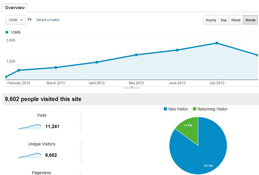
Website analytics can tell us a significant amount of information about the way visitors respond to your website. Analytics data can tell us a lot more than just how many website visitors your site is getting. It can tell us how long people are staying on your site, what they are clicking (or not clicking), where they are scrolling, what pages are most visited, which pages are rarely ever visited, which pages people are leaving your site after visitor, length of time spent on pages, etc.

The image below is a heat map of the mouse movement of site visitors to our site and is also tracking what parts of our site are being clicked (you can click it to see a larger version).

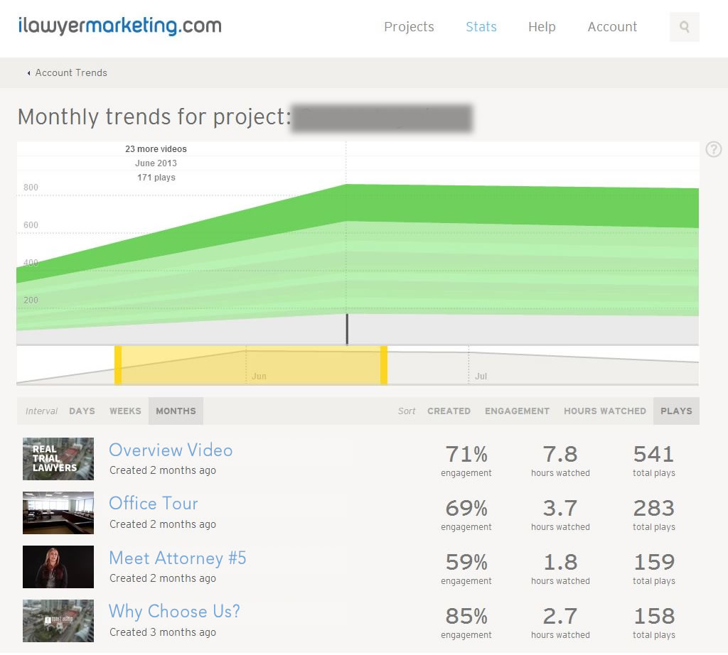
If you have video on your site, you want to know if people are even watching your video. If they are watching, you want to know how visitors are engaging with that video. For example, are they playing the video and then leaving after 8 seconds? Are most visitors watching the video the whole way through? Are your videos too long? Are they even finding the videos? The answers to all these questions are right there in the data.

How a Great Website Can Help You Get More Cases
Having a great website is a key part of growing your law practice. After all, it is the foundation of your marketing success. If you are relying on the web to help you generate new clients like most law firms today, it’s important that you understand that even an average looking website can cost you new clients. After a decade of experience in this industry, I’m still surprised to see how many law practices who going after high value cases fail to recognize the importance of having a website that is superior to competitors (at at least as good). They want big cases…but they fail to properly invest in the very thing that can help them convert more website visitors into actual potential cases. Studying website analytics over the past 10 years has made one thing crystal clear: You will never maximize the potential return on your marketing dollars without having a website that is better than your competitors. For some this is obvious and logical to assume but that would be strictly an opinion (it was always mine) but the data does not lie. It’s important to understand that the average website consumer is comparing 5 sites on average when trying to find a lawyer. Many people research much more just 5 but the point is your website is being compared to your competitors. When your website does not give your site visitors a reason to call you first, you often end up with leads for cases that other attorneys have already rejected.
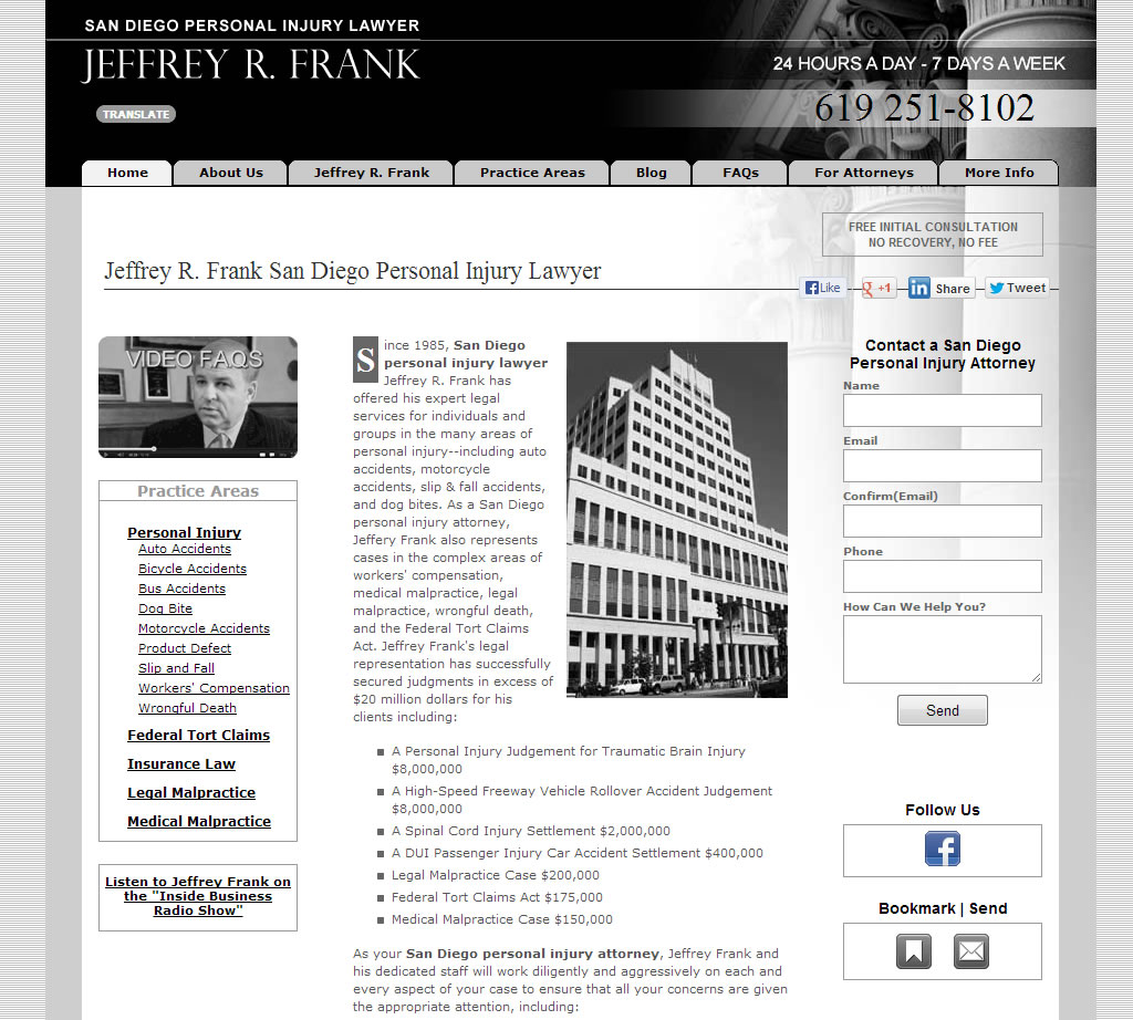
Put yourself in the consumers eyes here. You want the biggest result for your injury case. What firm are you going to call first from the sites below?


No doubt the Gomez Iagmin website is the most impressive just from the image here and it’s even more impressive if you were to browse through the site. The great majority of the time, that firm would get the first phone call from someone comparing these sites because of the powerful first impression that the site makes on users. Consumers directly correlate the way a site looks with the quality of that law firm (although in reality that is often not the case).
How do visitors see your site on mobile devices?
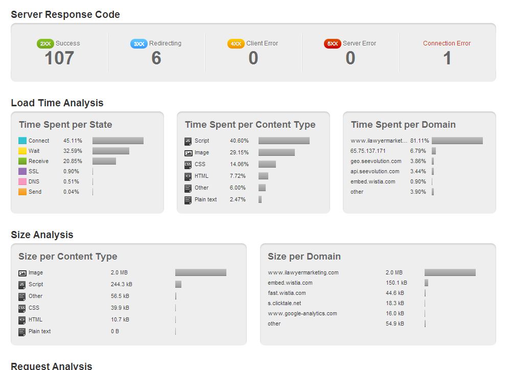
Another important aspect of your website is how visitors view your site on mobile devices such as iPhones, iPads, Android phones, etc. Data shows the use of mobile traffic to websites continues to grow every year and that trend will continue. Google recommends the use of responsive design for your site as usually that provides the best user experience for users. The “best user experience” is what Google wants to provide users so they give preference to sites that are optimized for mobile devices. Additionally, website load time is an increasing ranking factor in search results (again, related to user experience) so it’s important to have a mobile friendly site.

Sites that take too long to load lose visitors and what if that visitor ended up being a big case you missed out on? Invest the money on a responsive web design so this doesn’t happen to you.
Maximizing Website Conversion Rates
There is a lot more to designing a website then just throwing a design together and making it look good. There is a careful thought process that goes into every site we design and it begins with understand what consumers want to see when they are visiting a law firm website. In order to maximize conversion rates you need to direct visitors to certain parts of your site. From focus group testing and analyzing web analytics, we have been able to develop an in-depth understanding of website visitors and we use this information on every site we develop.
The important thing to remember is trying to save money on a website design can end up costing you big revenue down the road. While we understand the importance in any business to keep costs down, you will never maximize the revenue you can generate for your law firm unless you have a killer website that helps you convert visitors into actual clients.

